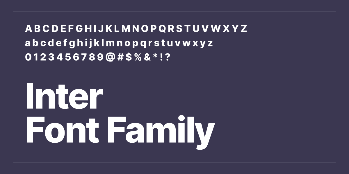
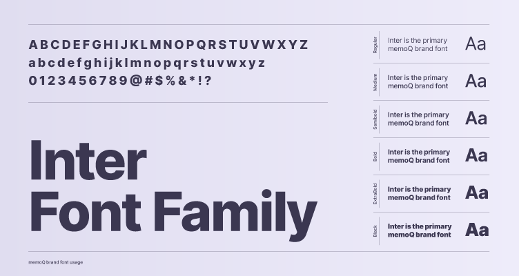
memoQ brand guidelines

Typography

The typography chapter outlines the key principles and guidelines for using typefaces within our brand materials. Typography plays a critical role in shaping our visual identity, ensuring readability, and conveying our brand's tone. It helps create a cohesive and professional look across all platforms, from digital to print, enhancing the overall brand experience.

Download Inter font
Primary typeface

Inter is the primary brand font, chosen for its clean, modern, and highly legible design. Its versatility across various sizes and weights ensures consistency and clarity, reinforcing our brand’s contemporary and professional identity.

Secondary typeface

The Segoe UI font family is a clean, modern typeface commonly used in user interfaces. It features rounded letterforms that offer readability and a friendly, approachable look. As a default font for many Microsoft applications, it maintains a balance between elegance and simplicity.